
Pushing Through the Foliage: Lessons Learned
I'm not sure I'll ever draw anything as challenging as this piece. Not because of any particular technical complexity, but because almost every element was new territory for me. The surface, a full landscape, dense foliage, varied grasses - all of it pushing me beyond my comfort zone. Until this point, my artwork had centred on pet portraits, with a couple of wildlife pieces and some experiments with sand and water. This piece? It became a journey of constant discoveries - those "ah-ha!" moments - and (plenty of) muttered expletives.
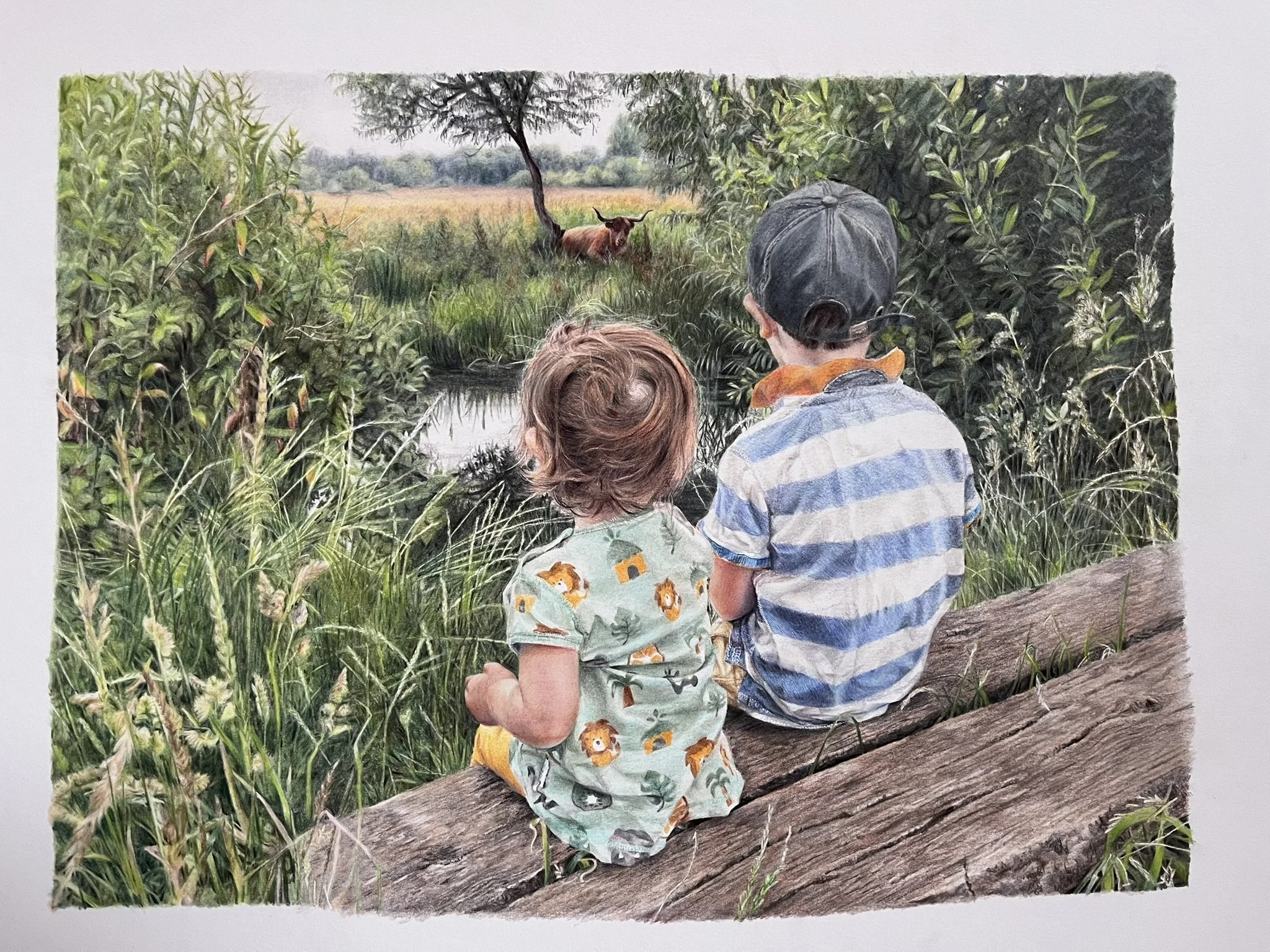
‘Snack Break’
By the time I reached the top right of this artwork and this particular shrubbery, I'd been working with the surface for a few months (yes, it took a while) so I knew what worked. I was battling with the excitement to finish - and add the highland cow as a final treat. While I LOVE the process, I wanted to get to that cow. I didn't want to slow down, but I also didn't want to rush and spoil it. And, oddly enough, a huge part of me didn't want it to end!
Step 1
From working on the foliage on the left side, I'd learned a crucial lesson about myself: I am not a particularly patient artist. I like to get on with it, to see where I'm going. So I started by mapping in values early - a quick way to check the feel of the composition. I also know I tend to get lost in the drawing process and will deviate from any careful plan, so preserving my highlights from the start became essential. Where are my lights and darks?
I used a warm yellow-green for the foreground, creating rough linear shapes with sketchy back-and-forth strokes - these would eventually become leaves and stems. For the other foliage, I chose a cool dark green. The reference photo was inspiration rather than something to copy exactly. The key here? Keeping those layers light - gentle pressure - making it easier to refine and add detail later.


Step 2
They say getting started is the hardest. Nope. Not here. Not with this detailed behemoth in front of me. The hardest bit is this next bit - when I started to draw in some of the shapes and realized just how bl**dy long it was going to take. I powered through. Put some music on and strapped myself in mentally for many more hours.
I picked up a Dark Indigo and started refining those shapes. I worked backwards. Added a bit of mucky green in the midground for variety (and because it felt nice to pick up a new pencil after an hour with just the one). I couldn't maintain those thin stems without losing my mind, so I dabbed out some pigment and grabbed a White Pablo. Applied enough pressure to indent the surface and the dark pigment skipped over. Happy dance. I kept going. Took a break. Came back. The next bit was easier.
Step 3
Now I was getting somewhere. Time to commit to those darker areas. Those tiny black triangular shapes started pushing the depth (yes, finally reaching for black - a Pablo). More pressure here, but keeping those palest leaves light - just a couple of layers of pigment.
Remember those sketchy shapes from the start? They were paying off now, guiding where to build depth and where to hold back. It was all about balance - knowing when to push darker and when to let those lighter areas breathe. I went back to my reference photo here - just to see if I had that variety.


Step 4
While I was happy with progress, something still felt a bit flat. A bit dull. I reached for a softer, paler pencil (Luminance Verdigris became my favourite) and pressed firmly over those dark layers; suddenly - leaves emerging from the depths! Way quicker than all that careful negative drawing from earlier. Sometimes the best solutions come from just trying something different when you're stuck.
I'd done all the hard work establishing depth, and now I could pull these lighter leaves forward without spending hours working around them. Turns out you can add a bit of light over dark - especially if you’re craving a muted result.
Step 5
Almost there. Time for those final touches that made all the difference. A bit of bright vibrant green on the tips of those foreground leaves - because sometimes you need that pop of color to bring everything to life. If I found a shape that wasn't quite right - Scotch Magic tape became my best friend. Just a gentle pressure to lift that top layer of pigment and - voila! - instant highlight or leaf reshaping.
This piece helped me develop a lot as an artist. I grew so much in confidence, because I took a few risks with colours and techniques. I fell in love with drawing landscapes because I found that freedom to deviate from the reference photo - to play in the shadows. Although I had my own internal battles with patience, I genuinely enjoyed working on this throughout and was never bored* - there was just so much variety (*okay, Step 2 above tested me just a little…!).

Materials & Details
Title: "Snack Break"
Size: 10.5 x 14.5 inches
Surface: Rising Museum Board
Pencils: Caran d'Ache Luminance, Derwent Lightfast, Caran d'Ache Pablo, Faber-Castell Polychromos
Reference photo: My own