
The Quiet Power of Monochrome
There are two things all my monochrome artworks have in common. First, they were all challenging subjects for me. Soft faces, detailed textures or reflected subjects. Moreover, they were personal. My cat. My kids. Reference photos hurriedly taken, a snapshot before they moved. As a new coloured pencil artist, I remembered how much I loved these photos and went back to search for them - adding to that ever-growing album of 'ref photos' on my phone (do you have a wish list? Like a stack of books you'll read 'one day'?).

Both of my Monty drawings have since won awards, and my baby daughter in the grass was developed into a step-by-step tutorial for Ann Kullberg's Color Magazine. Personal subjects for me, that also resonated with other people. A reminder that we can also create a connection with our audience in the absence of colour.
Perhaps when we strip away the distraction of multiple hues our focus shifts to the fundamental elements that make artwork compelling?
The Power of Artistic Limitations
For those newer to art, let me clarify a couple of terms I'll be using throughout this article. "Monochrome" simply means working with variations of a single colour (mono = one, chrome = colour). This is different from greyscale, though greyscale is one type of monochrome. "Value" refers to the lightness or darkness of a colour. A realistic artwork often has a range of values.
We often think more options equal more freedom but this can also lead to overwhelm. By restricting your palette to variations of a single colour, you can focus on fundamental artistic elements and strengthen those skills:
Value Drawing Practice
Value drawing concentrates on depicting lights and darks to achieve depth. Working with a monochrome palette forces you to develop a keen eye for subtle value shifts - those tiny variations between, say, Cold Grey I and Cold Grey II suddenly become important. In my monochrome pieces, I've learned to see at least 7-9 distinct values where previously I might have only noticed 3-4.
Many beginners with coloured pencil are advised to be braver with their darks, and monochromatic pieces offer wonderful exercises to practice with a full range of values. I've been drawing more human portraits recently, where the value changes needed to convey facial features, expression, and emotion can be extremely subtle. Rather than applying heavy pressure for darker values, I prefer swapping to a darker pencil within the same colour family - preserving the paper's tooth and allowing for more control throughout the drawing process.
Drawing Attention to Composition
Colour can sometimes mask compositional issues. Working in monochrome puts your composition under a spotlight - either it works or it doesn't. This clarity has improved all my artwork, including full-colour pieces.
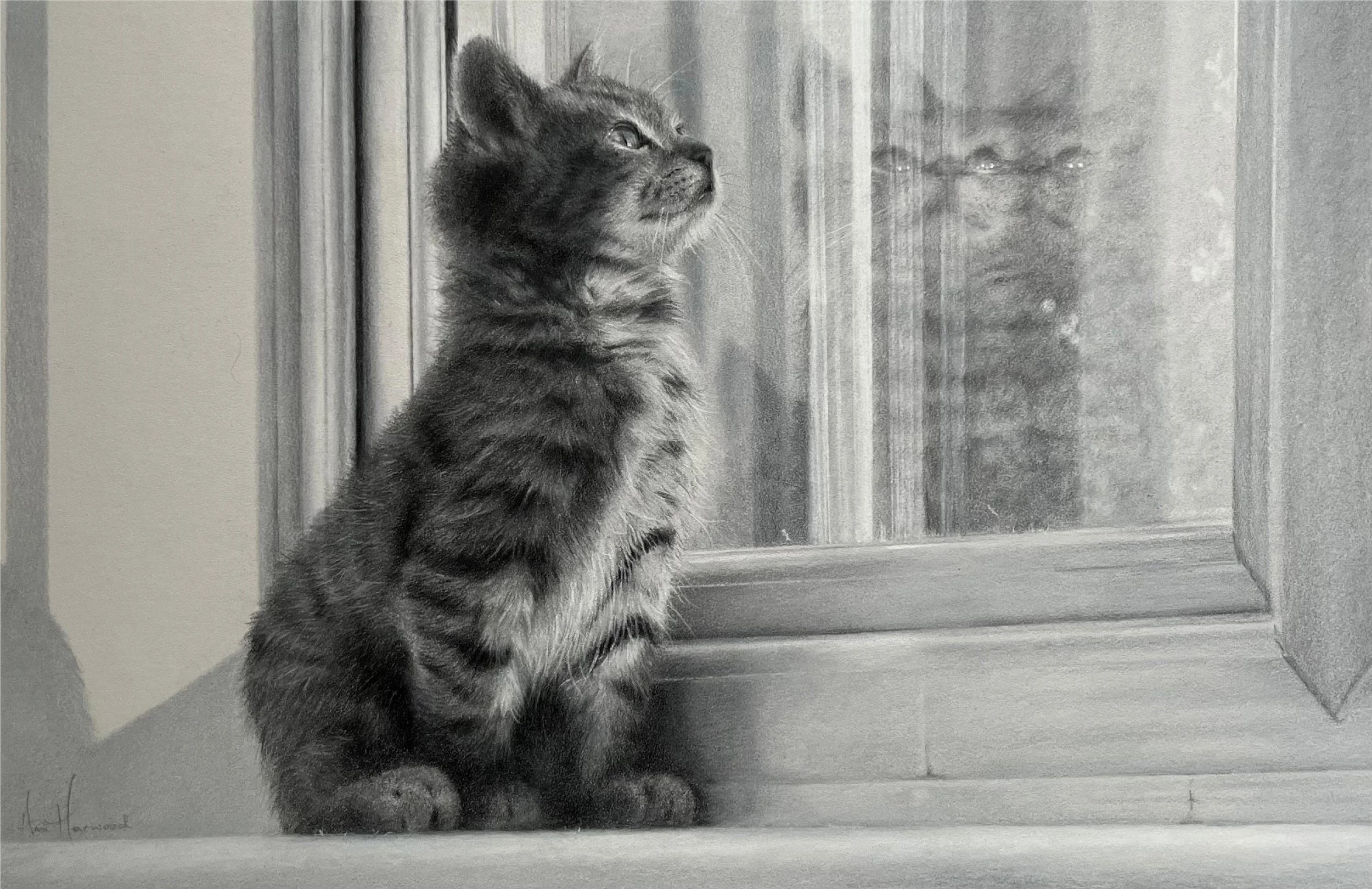
Take my "Monty in the Winter Sun" piece – I wanted viewers to notice both the realistic kitten and his abstract reflections in the window. With monochrome, the tabby brown fur couldn't visually merge with the brown wall behind the glass. The stripped-back palette ensured the structural relationship between cat and reflection remained the star of the show, something I might have struggled to achieve with full colour.
Emphasising Shape, Line and Texture
When colour isn't telling the story, form and texture must do more work. By reducing visual information, both you and your audience naturally focus on these fundamental artistic elements.

"Monty in the Winter Sun" allowed me to concentrate entirely on capturing the depth and texture of fur, while my second cat piece, "I Wonder," gave me the freedom to emphasise shape and line – the gentle curve of the kitten's back contrasting beautifully with the linear window frame. These elements might have been less pronounced if colour had been competing for attention.
The techniques I developed for rendering different textures in monochrome – fur, fabric, skin – have significantly improved my colour work (where I previously put so much emphasis on colour selection that textures became almost an afterthought!).
Enhancing Connection and Clarity
Converting photos to monochrome offers two significant advantages: it eliminates visual distractions and creates a stronger connection to the memories captured.
When I removed colour from "Daddy's Little Explorer," my daughter's expression of intense concentration became the clear focus, no longer competing with her bright clothing. In "Hot Chocolate to Share," the warm grey palette allowed the quiet moment between my children to speak more clearly than it might have in full colour.
This clarity deepens the connection to these personal moments. There's something about monochrome images that reminds us of old photographs, adding a timeless quality that transcends trends. Viewers often look beyond surface elements in monochrome work, connecting more directly with the human experiences being shown.


The Practical Side of Monochrome
Beyond the artistic benefits, monochrome drawing offers practical advantages:
Faster Completion: Without colour-matching concerns, many artists (myself included) work more quickly in monochrome. This makes it excellent practice for developing drawing skills without the time investment of full-colour pieces.
Cost-Effective Experimentation: You can create a monochrome drawing with as few as 4-5 pencils, making it economical if you're trying a new surface or technique.
Skill Isolation: Monochrome drawing lets you isolate and develop specific skills like creating depth, understanding value relationships, or capturing texture - all foundational skills that enhance your colour work.
Getting Started with Monochrome
Ready to try monochrome drawing? Here's my approach:
Step 1: Choose Your Subject Wisely
Not all subjects are equally suited for monochrome treatment. Look for reference photos with:
Strong lighting - Directional light creates clearer value separation
Interesting textures - Fur, fabric folds, or varied surfaces work beautifully
Emotional resonance - Portraits with expressive faces or nostalgic scenes
Clear compositional elements - Distinct foreground, midground, background
I often convert my reference photos to black and white first to evaluate whether they have enough contrast and interest without colour.
Step 2: Select Your Monochrome Palette
There are several colour families to consider, each creating a different emotional impact:
Cool Greys: Create a contemporary, almost silver-like quality that works beautifully for reflective surfaces and winter scenes. These can feel clean, precise, and somewhat detached - perfect for architectural elements or subjects with technical details.
Warm Greys: Invoke comfort and intimacy - ideal for capturing tender family moments. These have a gentle, nurturing quality that works wonderfully for portraits and domestic scenes. (side note: if I drew my daughter in the grass again, I’d probably opt for warm greys - the current artwork feels a little cold to me).
Sepia/Brown Tones: Create a warm, nostalgic feel reminiscent of old photographs. These connect to historical photographic traditions and can give your work a timeless, classic feel.
Blues: Can create a moonlit, ethereal quality - excellent for night scenes or dreamlike images. Their cooler temperature evokes calm, contemplation, and sometimes melancholy.
Greens: Work well for natural subjects, creating a connection to woodland scenes and the natural world. These can range from vibrant, spring-like feelings to deeper, more mysterious forest moods.
Remember, the goal is to have enough pencils within your chosen family to create smooth transitions between values. For beginners, 4-5 pencils ranging from very light to very dark will suffice. As you progress, you might expand to 6-9 pencils for more subtle gradations.
Step 3: Create Your Value Map
Before diving into details, I find it helpful to map out the major value areas in my piece. While some artists create small thumbnails focusing on the extremes of light and dark, I prefer to work directly on my final piece, mapping in larger sections.
A critical mental exercise is to consider the "whites" throughout your image first. Decide whether you'll preserve absolute whites by avoiding those areas entirely, or if you'll establish a very light base tone across the entire piece.
When mapping values, I rarely use my darkest value (like black) at this stage, as I want to ensure I have somewhere left to go later in the drawing process. Instead, I might use a shade or two lighter - Payne's Grey or Cold Grey VI, for example - knowing I can always increase the depth later if needed.
Step 4: Build Your Drawing, adjust your values
I generally begin with my lightest values, gradually building to darker ones. However, there's one exception: I often lightly map in my darker areas early on to establish the full value range and avoid making the piece too light overall - a common beginner mistake (see Step 3).
Techniques for Adjusting Values:
As you work, you'll likely need to adjust values. Here are some techniques I rely on:
Putty Eraser Technique: Gently dab a kneaded/putty eraser on areas where you need to lift pigment. This works especially well for creating soft highlights or lightening an area that's become too dark. You can also use this subtraction technique to add texture in a way that is not overly precise or controlled.
White Layering: Apply a layer of white pencil over an area that's become too dark to "knock it back" slightly. This creates a subtle veiling effect that can be particularly effective for atmospheric elements or suggesting distance.
Dark Layering: For the darkest areas, gentle burnishing (applying heavier pressure) with your darkest pencil can create rich, deep values. I save this technique for final touches, as it compresses the paper's tooth.
Step 5: Focus on Transitions
The magic of monochrome happens in the transitions between values. I pay special attention to these edge areas, sometimes using gentle circular strokes to create subtle blends between values. Remember to change pencils rather than increase pressure when you need to go darker - this preserves the paper's tooth and allows for more control.
Your Monochrome Challenge
Do you have a special photo waiting in your reference collection? Perhaps one that seems too challenging to tackle? Consider trying it in monochrome.
Play around with some filters on your phone or computer to convert it to a single colour palette (try greyscale, silvertone, and noir). While you'll still need to make decisions about values, you'll no longer need to worry about colour theory or matching exact hues. This simplification can be liberating. While I'm all for a good challenge, too many challenges at once can leave a promising idea sitting untouched (or in that ‘someday’ folder) while you feel overwhelmed.
If you've never tried monochrome drawing, start small with a focus on a single object with interesting light. For those who regularly work in colour, these projects serve as valuable "resets" that strengthen fundamental skills.
My journey with monochrome drawing fundamentally changed how I see and create art. By temporarily setting aside colour matching, I developed core observational skills that enhance everything I create. I invite you to discover this quiet power for yourself.