
Ginger Fur: Coloured Pencil Recipes for Your Back Pocket
Once upon a (not very long) time ago, I had a bit of a mental block around ginger fur. I simply find earthy natural tones easier to work with. Perhaps because most of these come from multiple layers blended together. A tweak here, a tweak there. Less pressure on that perfect pencil!
We all approach our art differently, and often that approach evolves over time. Usually I'd dive straight into a new piece - excited to start, learning a lot about mixing colours (and fixing mistakes!) through trial and error. While I love experimenting with colours, I am trying to be a little more thoughtful about the most effective way to achieve the effect I want - before I jump in. Not only is this more enjoyable for commissions (where let's face it, that pressure is a little higher), but I'm also discovering a lot of new favourites this way (and clearing my conscience about those pencils stored in a drawer and oft forgotten).


If you're newer to coloured pencils, you might benefit from my experiments, below. Think of them as a starting point from which to build. Nothing creates more overwhelm than a blank page and uncertainty about where to begin.
That's why I decided to investigate ginger fur systematically*. I wanted to provide clear descriptors of a few key pencils that could serve as a foundation to others. These aren't rigid rules - they're starting points. How did I arrive at these suggestions? By testing across major brands, comparing results, and discovering what consistently worked.
[*cough. Urm. What actually happened is I went down a rabbit hole. I pulled out a photo of the pencils used when I drew my last orange fur and thought - but what if someone didn't have x pencil? So I grabbed my pot of 'orange tones', any red-browns, ochres etc, and then went hunting through pencil boxes and drawers - only pencils I've actively used on projects have the honour of being out on display in the studio. cough. kitchen. I scribbled small test areas - sometimes annotating, sometimes discarding and forgetting and then scribbling a second and third time. Hey, science can be messy. Finally I had enough data to try a few combinations. The results are below.]
Brand-limited Recipes for Ginger Fur
Starting with a reference photo of what I considered a classic ginger tabby, I began looking for colours. I half expected one pure colour with varying values. A monochrome study should do it. But finding that perfect hue proved elusive. The purity of ginger fur, especially in good lighting without environmental reflections, was difficult to capture. Shades were too red, or too yellow or too brown.
Looking at my pencil collection, the choices felt overwhelming. So, like any good scientist, I applied some constraints. What if I limited myself to just one brand at a time? I settled on the following:
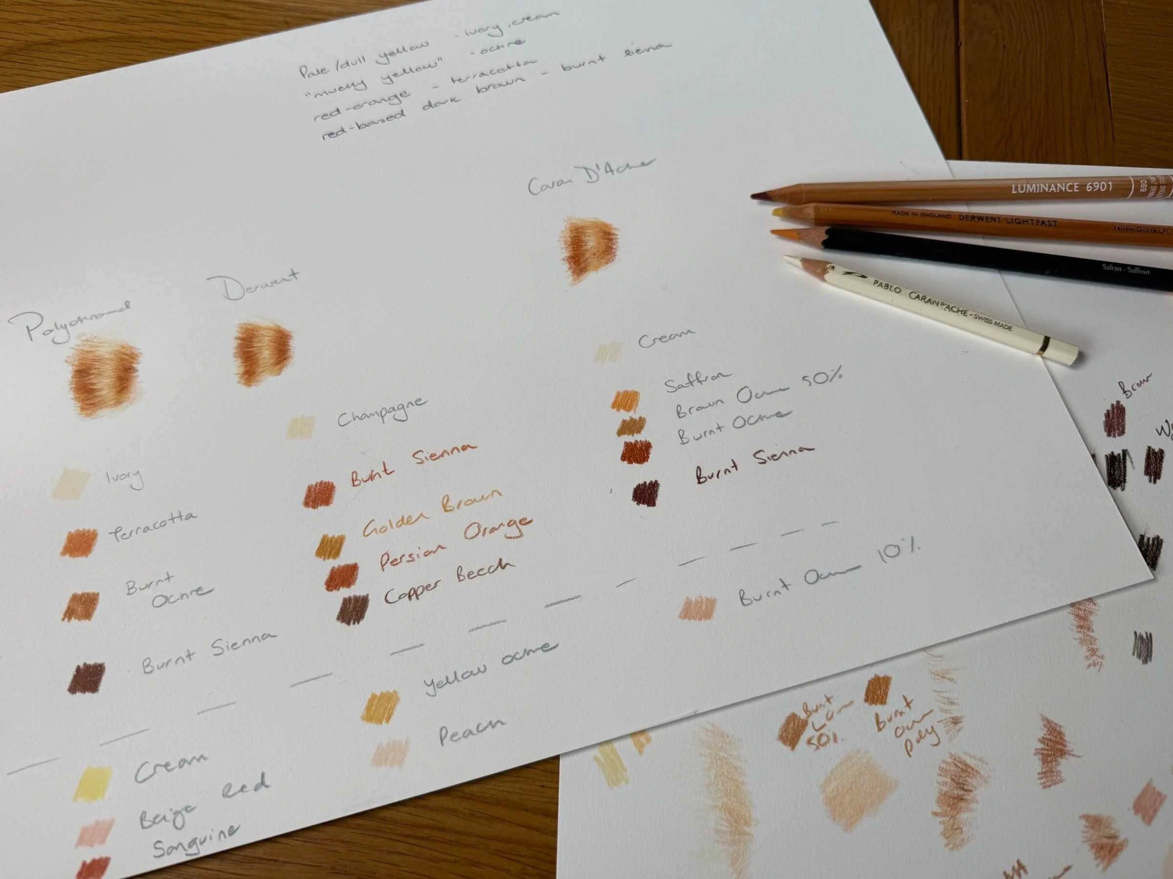
Faber-Castell Polychromos Recipe
Core colours: Ivory, Terracotta, Burnt Ochre, Burnt Sienna
Optional additions (for those little tweaks): Cream, Beige Red, Sanguine
Derwent Recipe
Core colours: Champagne (Lightfast), Burnt Sienna (Lightfast), Golden Brown (Artists), Persian Orange (Lightfast), Copper Beech (Artists)
Optional additions: Yellow Ochre (Lightfast), Peach (Lightfast)
Caran d'Ache Recipe
Core colours: Cream (Pablo), Saffron (Museum Aquarelle), Brown Ochre 50% (Luminance), Burnt Ochre (Luminance), Burnt Sienna (Luminance)
Optional addition: Burnt Ochre 10% (Luminance)

A quick note about these brands and surfaces:
Polychromos - I find them a little weak on their own, requiring more layers, but they're perfect for mapping out your piece and for glazing. They're also one of the most budget-friendly options in the professional range.
Derwent - I'll admit I don't use Lightfast as much as perhaps I should. And those Artists pencils? They're actually a nostalgic choice - I had a version when I was a girl, so I was keen to try them out again.
Caran d'Ache - Now, Luminance is a different beast altogether - softer, richly pigmented. You can work with fewer layers, if that's your style. The Museum Aquarelle works beautifully dry on vellum - rich, opaque and a little chalky. That brown is particularly lovely.
Notice how each brand needed slightly different numbers of pencils? That's down to their unique blends of pigments - the balance of yellow, orange, red and brown - and each successive colour I chose needing something different (the order of laydown undoubtedly influenced my choices).
Four-Colour Recipe
As I tested these combinations, a pattern emerged. Each successful recipe included:
A dull pale yellow/cream for your base tones
A mucky, earthy yellow (think ochre) for transitions
A reddy orange for those mid-tones
A red-based dark brown for depth
This forms what I'd recommend as a starter set, regardless of brand.
At this point, you might be wondering why I didn't stop here. After all, I had three solid recipes and a clear pattern. But anyone who knows me knows I can't resist a bit more experimentation...
The Ultimate Test
Enlightened by all this testing, I felt there was still something left to explore. With a new surface to try (Strathmore Bristol Vellum 400), I returned to my reference photo with fresh eyes. This time, I selected pencils purely by what the image needed, crossing between brands. Here are some notes on my process.
Application Process:
Ivory (Pablo) - Medium pressure base layer to train the surface with fur direction and provide resist for later layers
Burnt Ochre (Luminance) - Initial mid-tones (light pressure!) to establish those tabby stripes
Brown Ochre 50% (Luminance) - Building depth and softening transitions
Brown (Museum Aquarelle, dry) - A lovely deep dark red-brown for richest and darkest areas
Terracotta (Polychromos) - Perfect reddy-orange for glazing
Yellow Ochre (Lightfast) - Opaque and rich, perfect for bringing yellow tones back in
Burnt Ochre (Polychromos) - Additional warm tones - subtle alterations now
Burnt Ochre 10% (Luminance) - More pinky-toned, useful for toning down certain areas


Having these recipes in my back pocket was invaluable for when I sat down for the full test. I knew I had a starting point and also the freedom to adapt as I worked. If I have a ginger cat come my way again, I'm looking at that photo first. Then I'll bring out my notes.
Want to try these combinations yourself?
Download the reference photo here and see what works for you. I'd love to hear about your preferred combinations.